Choosing a Theme, Setting Tooltips, and Orientation
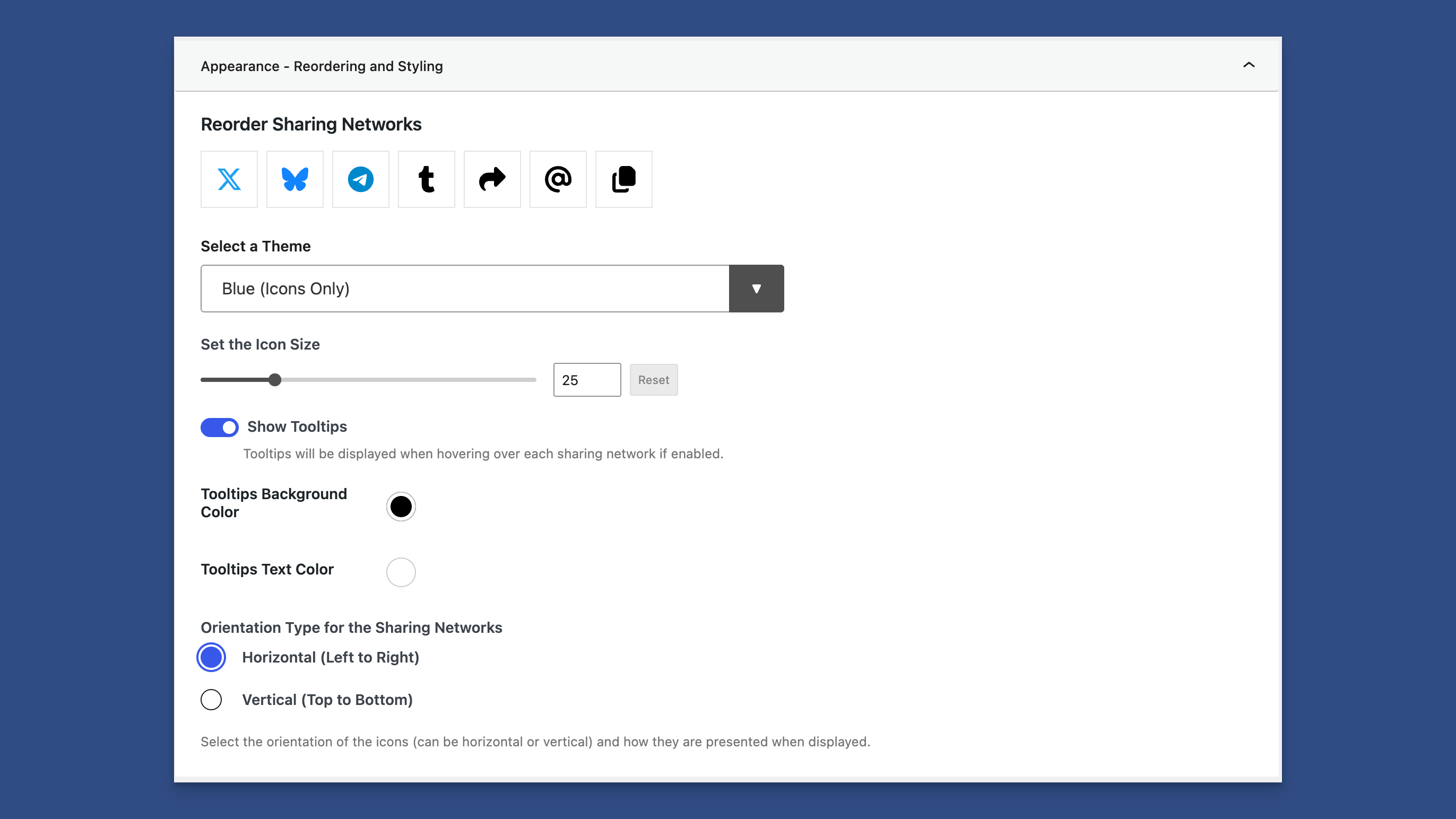
Appearance Panel for Setting the Content Sharing Appearance
Changing the appearance of content-sharing icons is easy. You can find the settings under the Appearance panel under the Content Sharing tab.
Built-in Themes
Choose from several built-in themes to quickly customize the look of Highlight and Share.
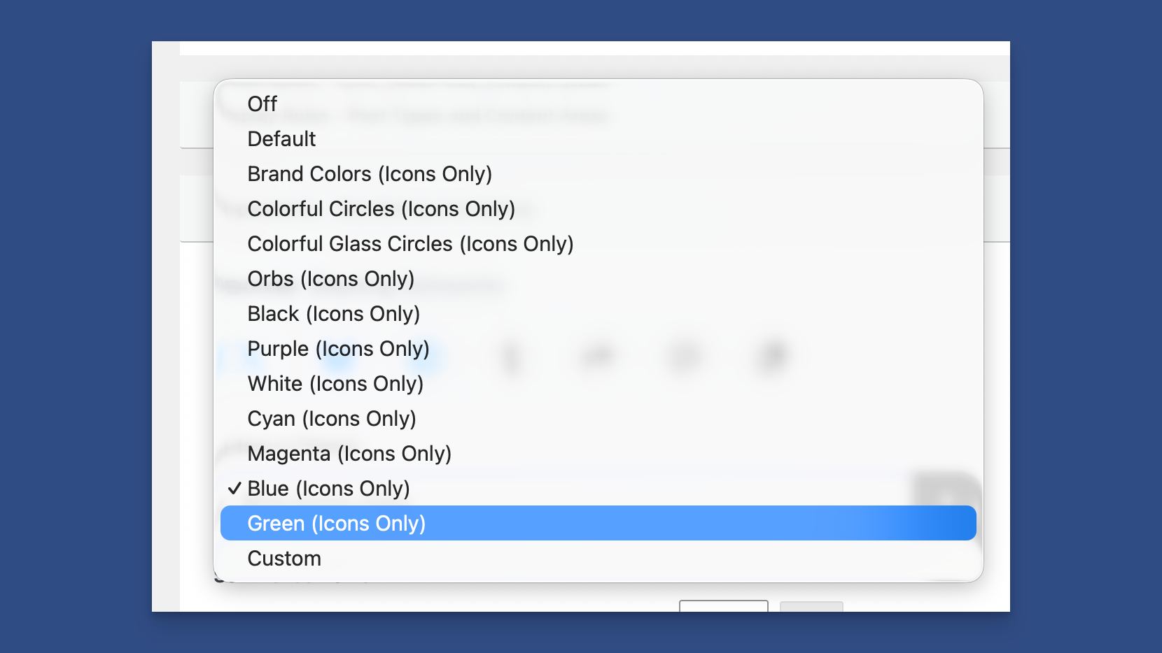
There are several themes to choose from
Available Themes
Unless otherwise noted, the available themes show only the icons, not the labels. A tooltip is available on hover if that option is enabled.
Default Theme
The default theme shows brand colors and labels.
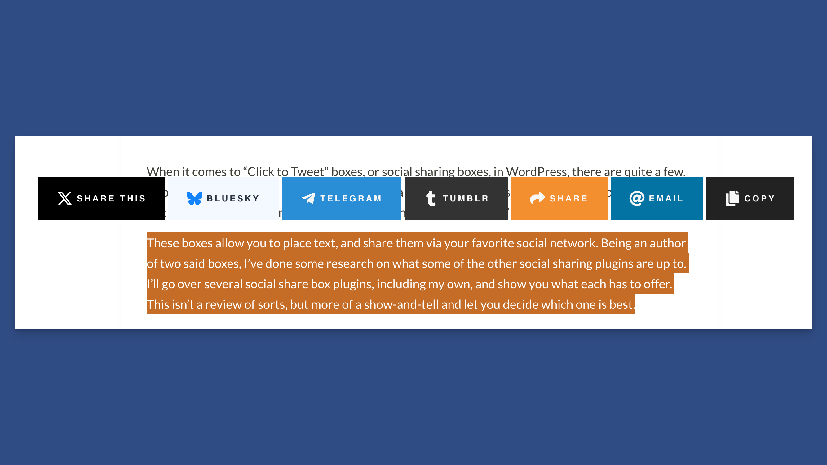
The Default Theme
Brand Colors Theme (icons only)
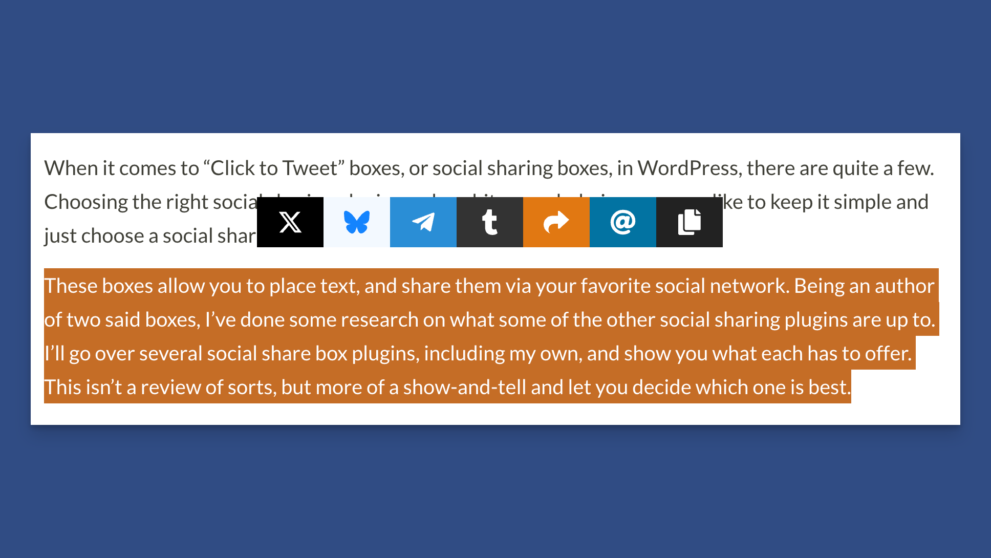
Branded Icon Theme
Colorful Circles Theme
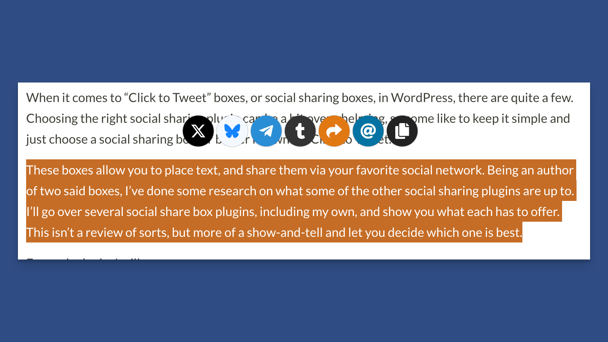
Colorful Circles Theme
Colorful Glass Circles Theme
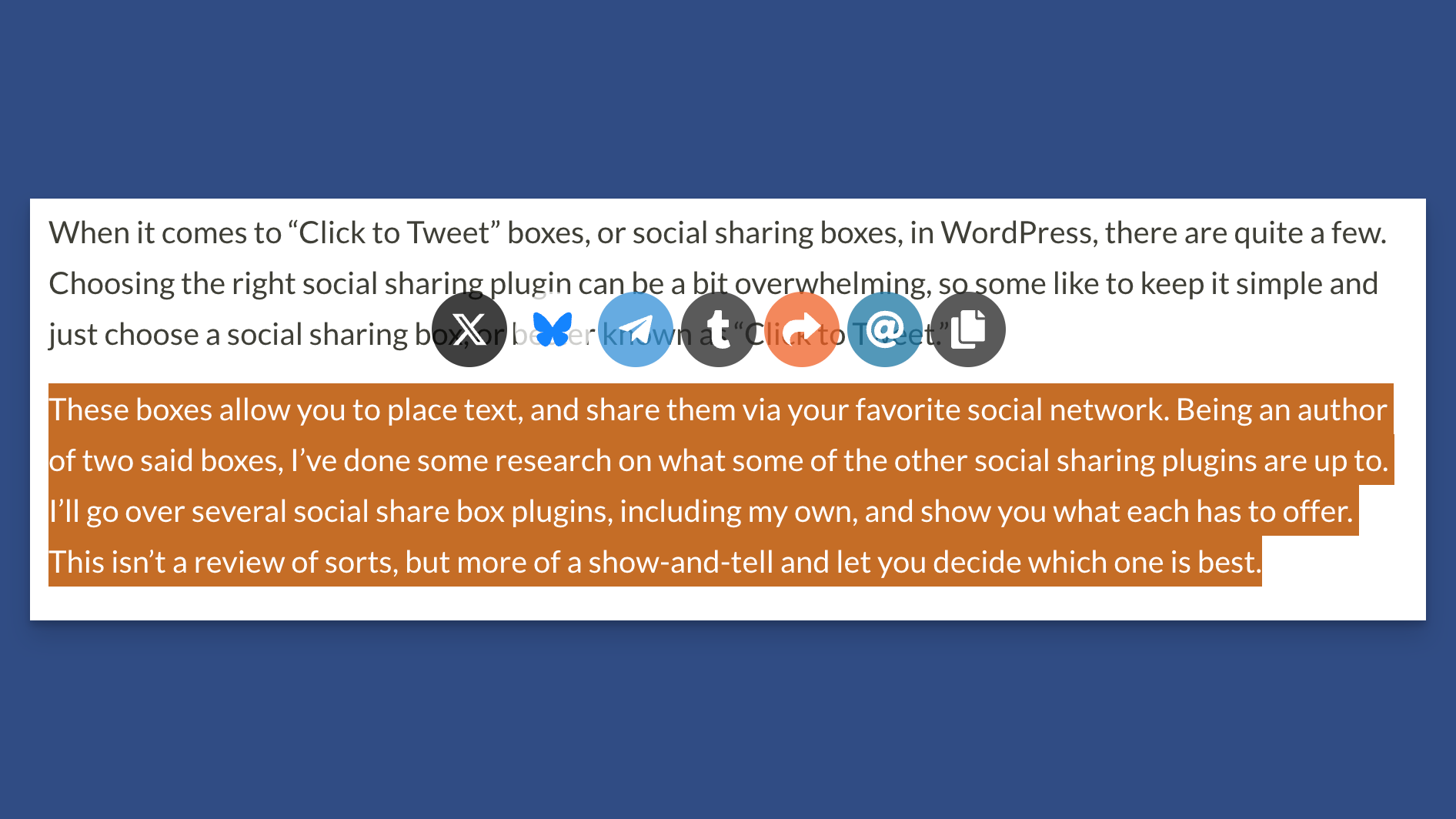
Colorful Glass Circles Theme
Orbs Theme
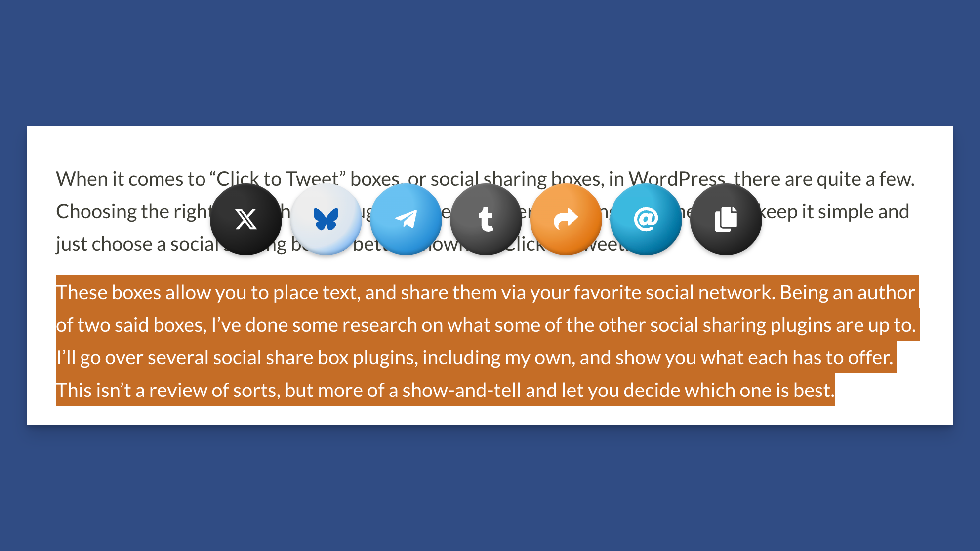
Orbs Theme
Black Theme
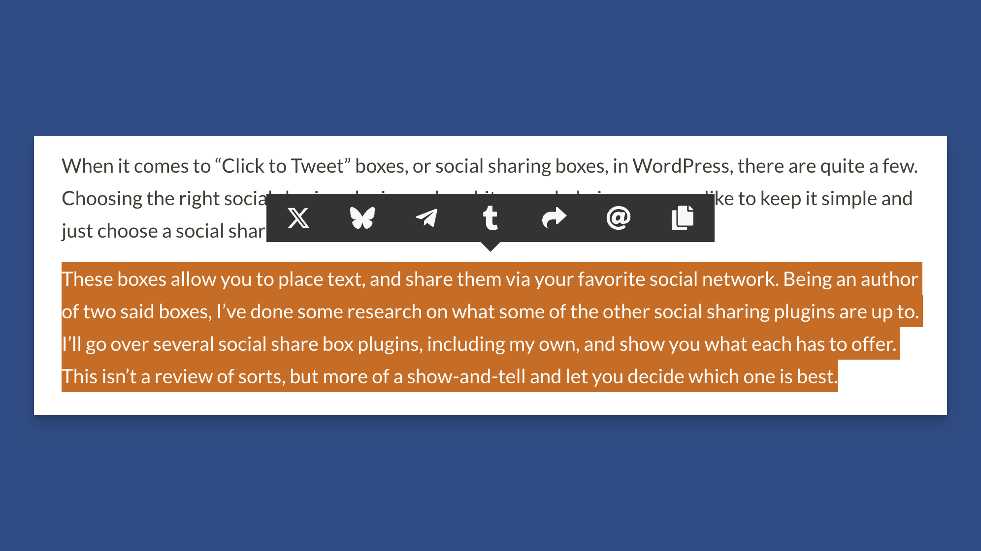
Black Theme
Purple Theme
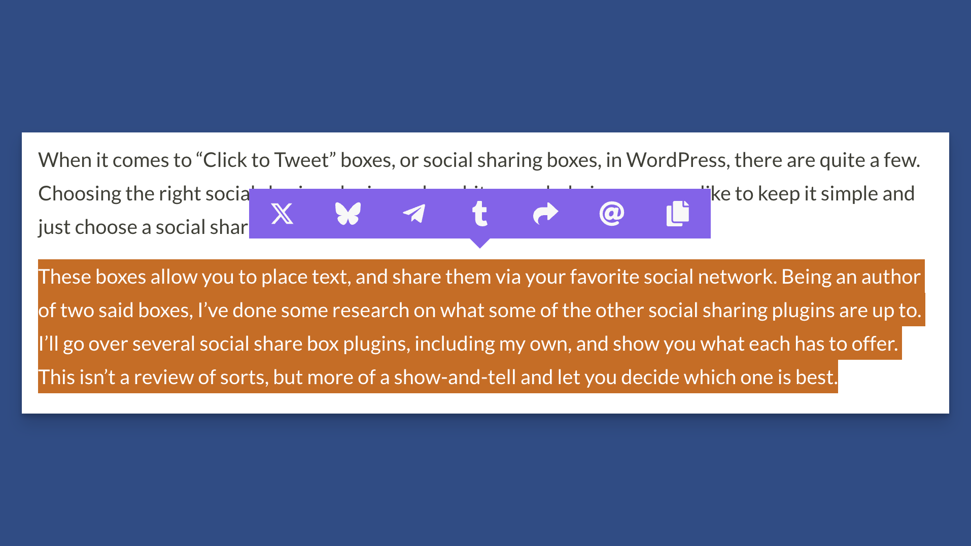
Purple Theme
White Theme
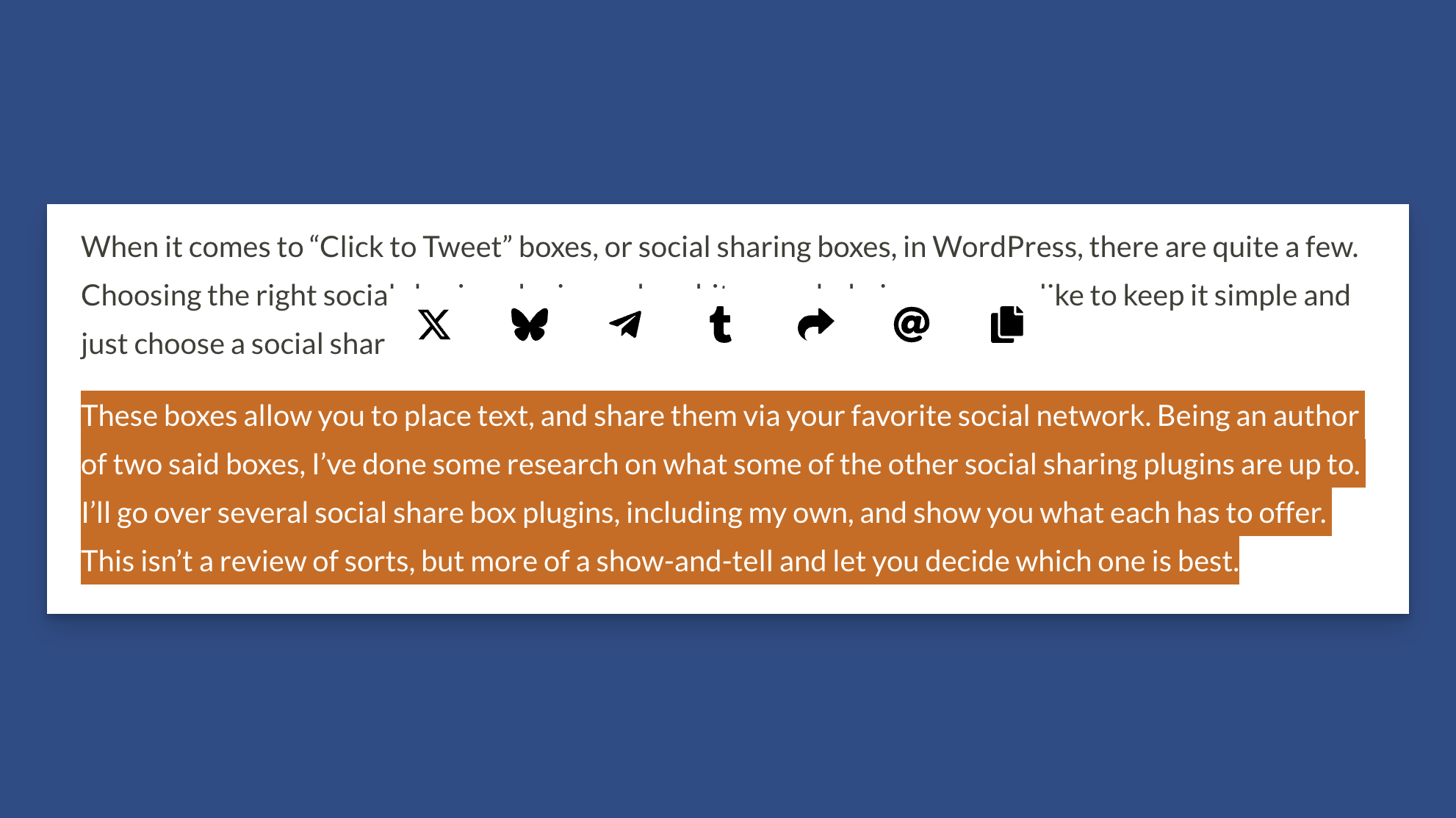
White Theme
Cyan Theme
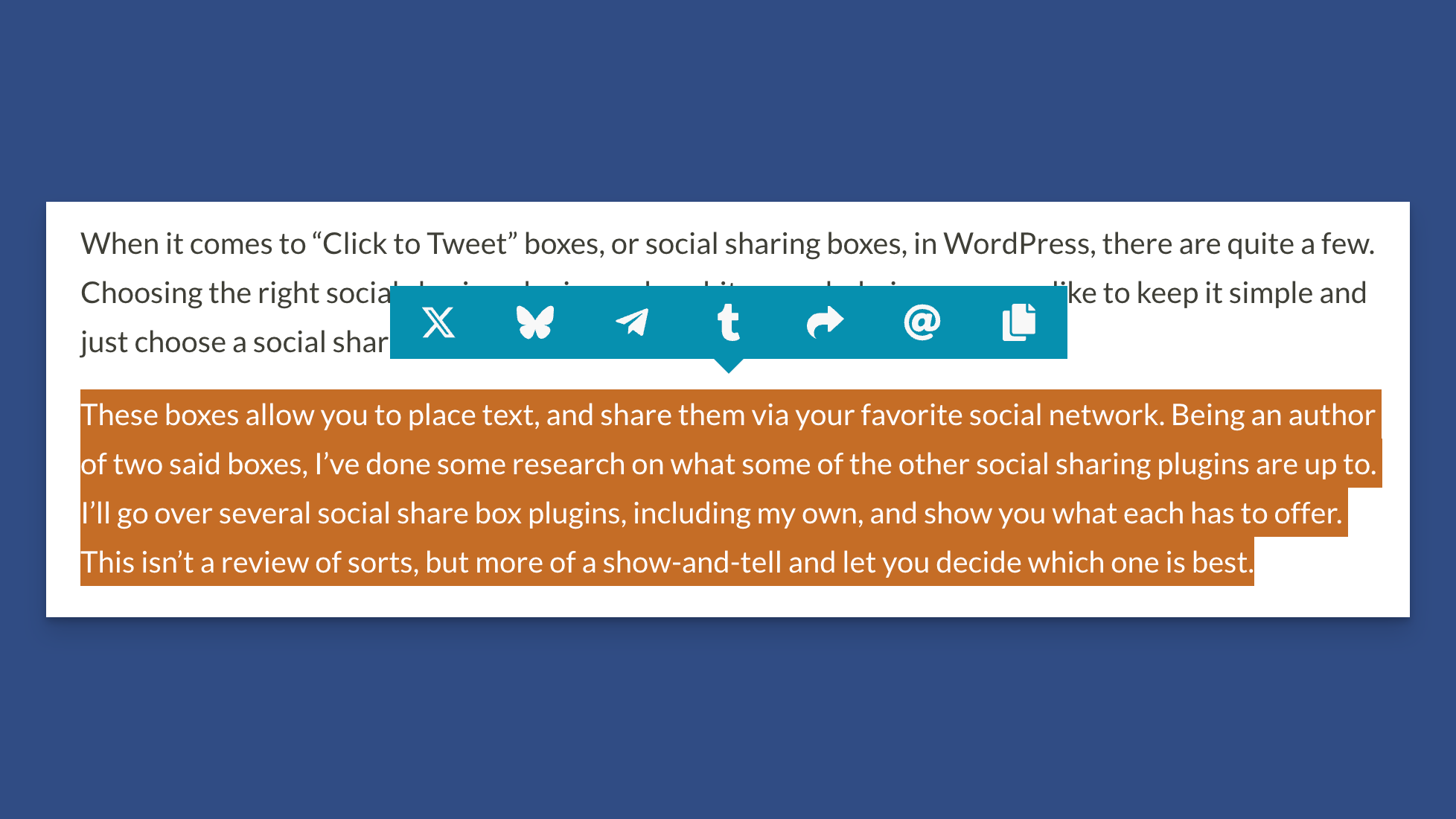
Cyan Theme
Magenta Theme
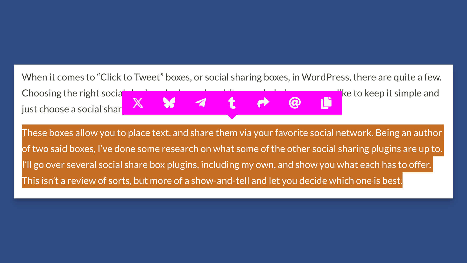
Magenta Theme
Blue Theme
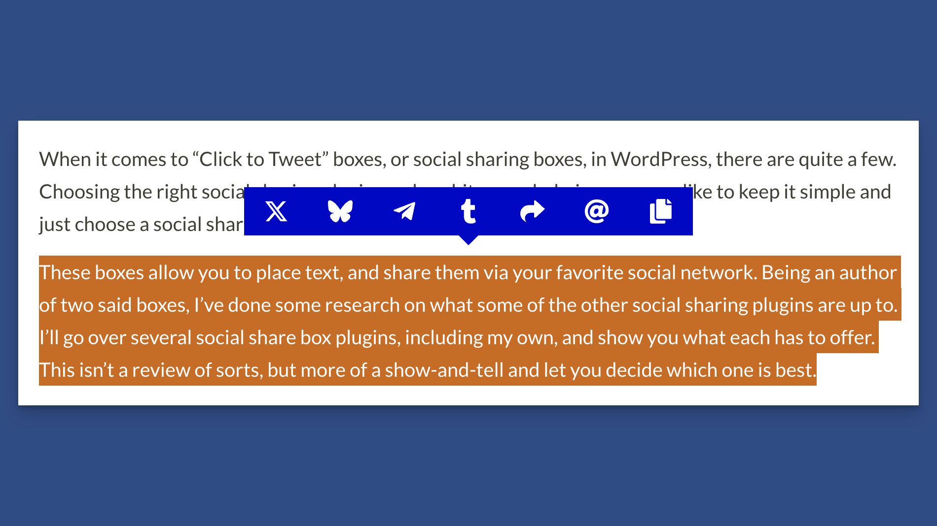
Blue Theme
Green Theme
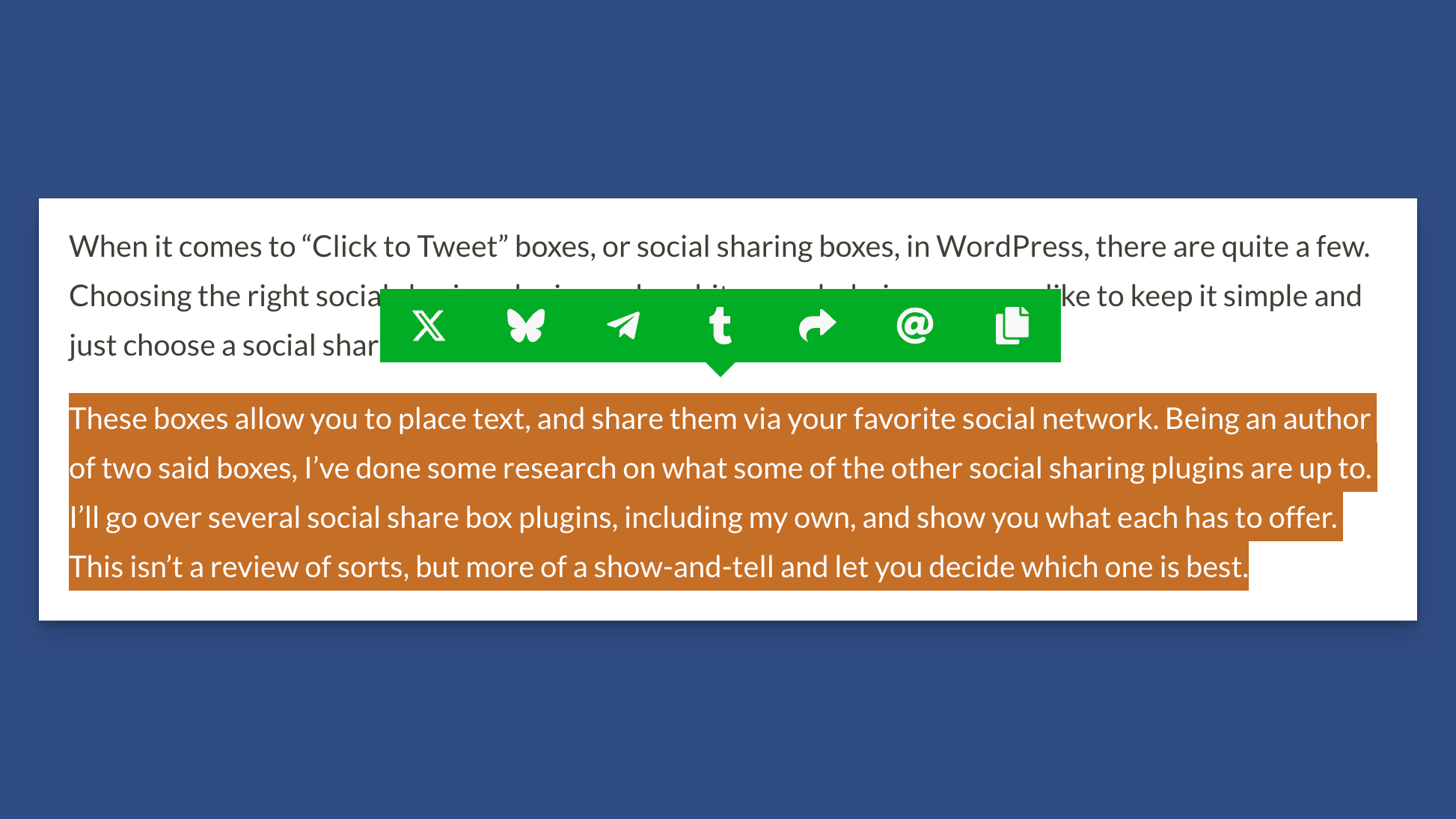
Green Theme
Icon Size
You can customize the icon size (default is 25) for any available theme.
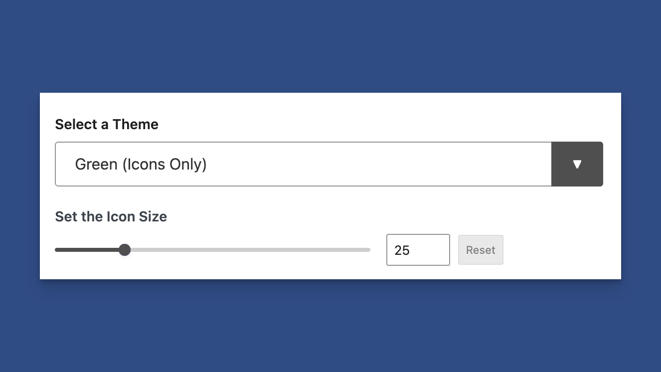
Adjust the Icon Size for All Available Themes
You can see a real-time preview in the Preview pane.
Tooltips
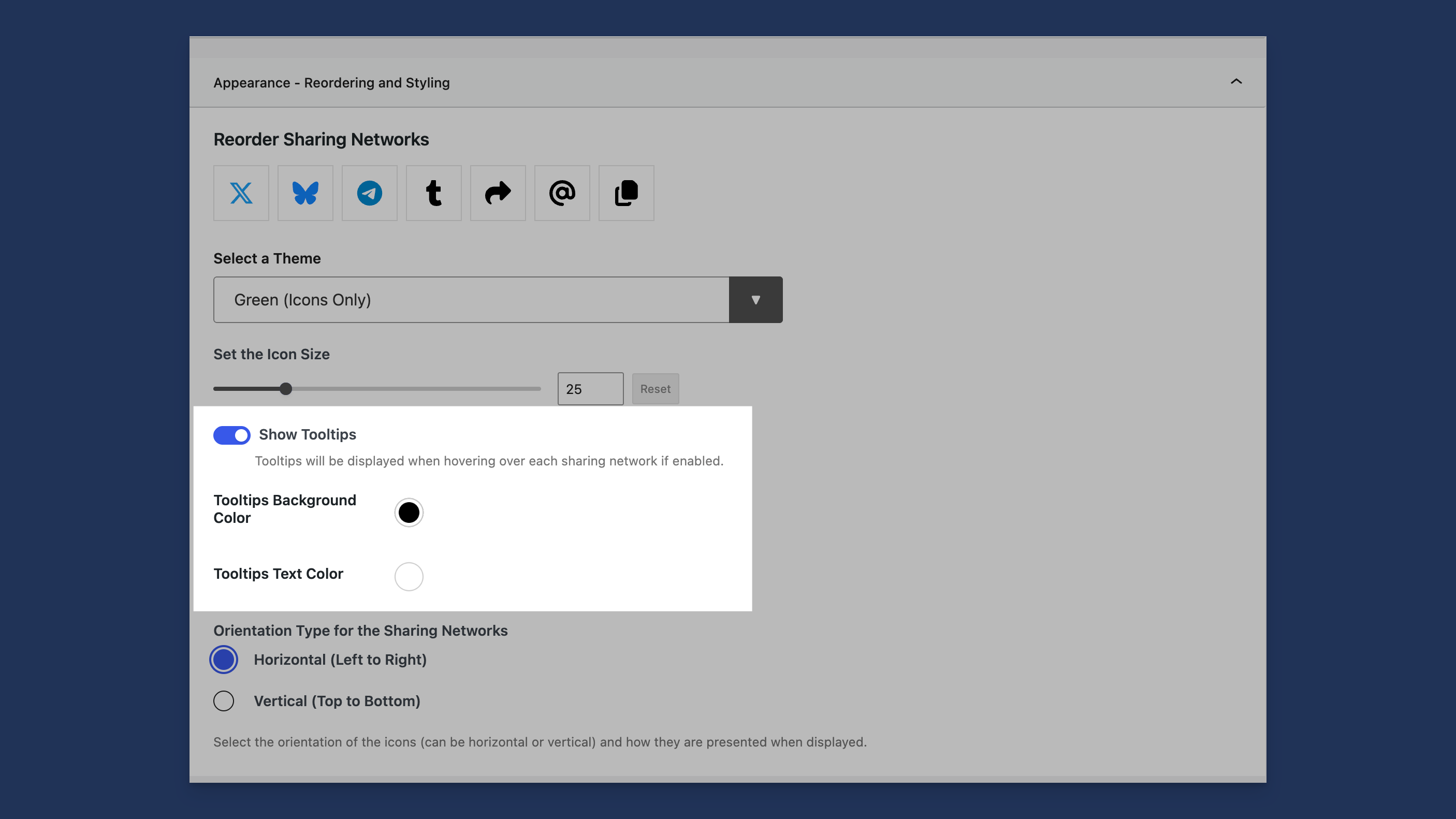
Tooltips Option
By default, a Tooltip is shown when hovering over a social network.
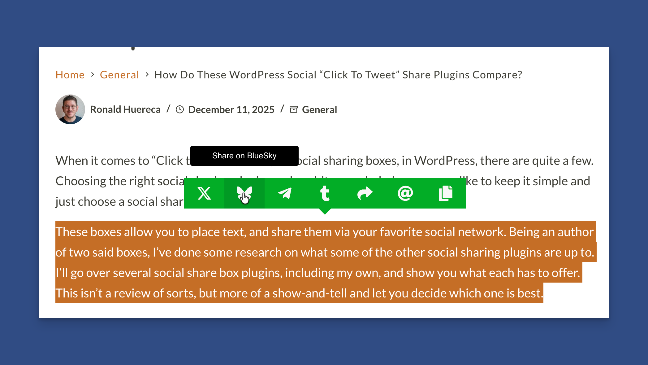
Tooltip Showing on Hover
To remove the Tooltips, simply toggle the Tooltip option and save your changes.
You can modify the Tooltips for each network in the Social Networks panel.
Orientation
You can choose between horizontal and vertical orientation.
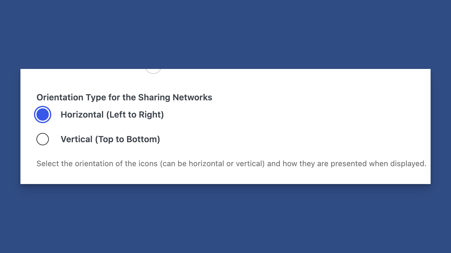
Orientation Settings in the Appearance Panel for Content Sharing
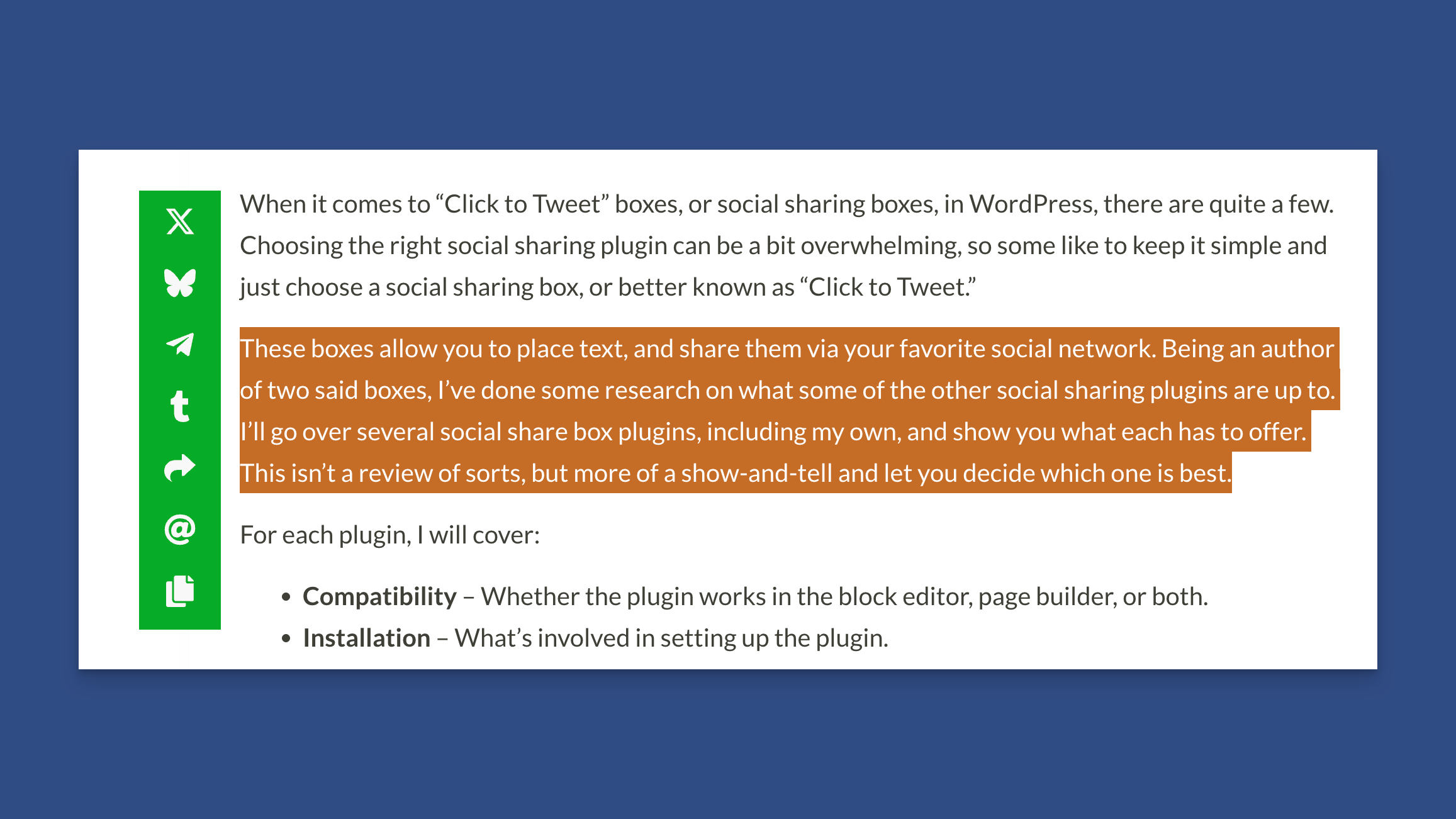
Vertical Orientation on the Frontend
Custom Themes
If you would like to customize the theme to your own specifications, you can select "Custom" from the theme dropdown.
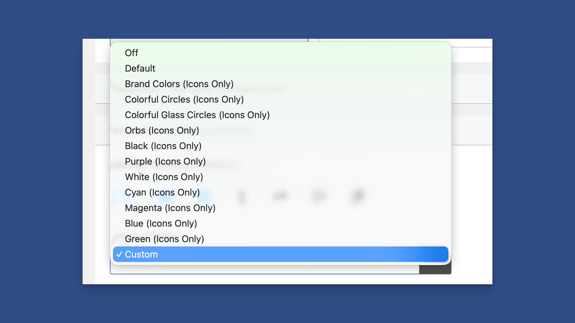
Select "Custom" to Configure a Custom Theme
Custom Themes will be covered on the next page.