Shortcode Parameters

Click to Share Box
The Click to Share box can be enabled via shortcode. Here's a simple shortcode in use below:
[has_click_to_share]This is some text I'd like to share.[/has_click_to_share]
It'll produce a default Click to Share box like shown below:
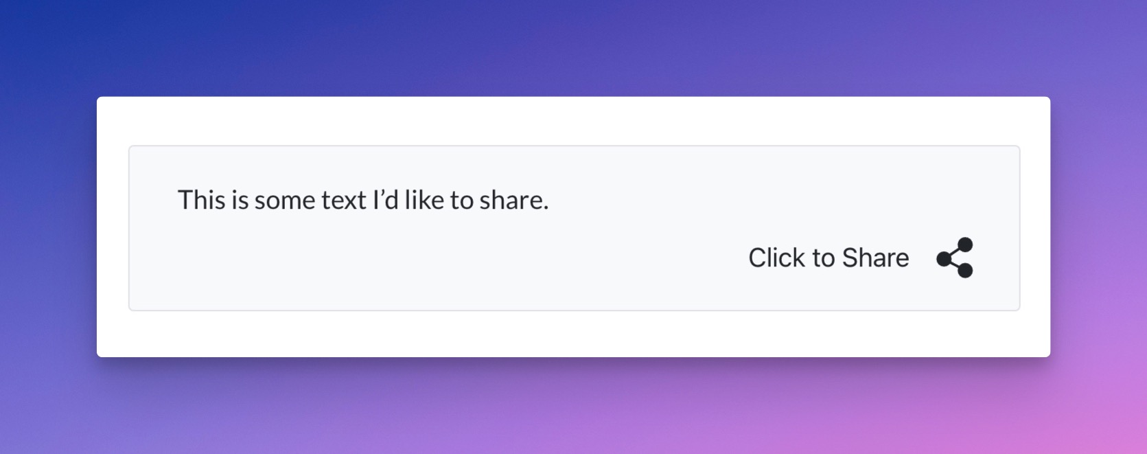
Default Appearance of Click to Share Shortcode
Here's a diagram of the various parts of the Click to Share box.
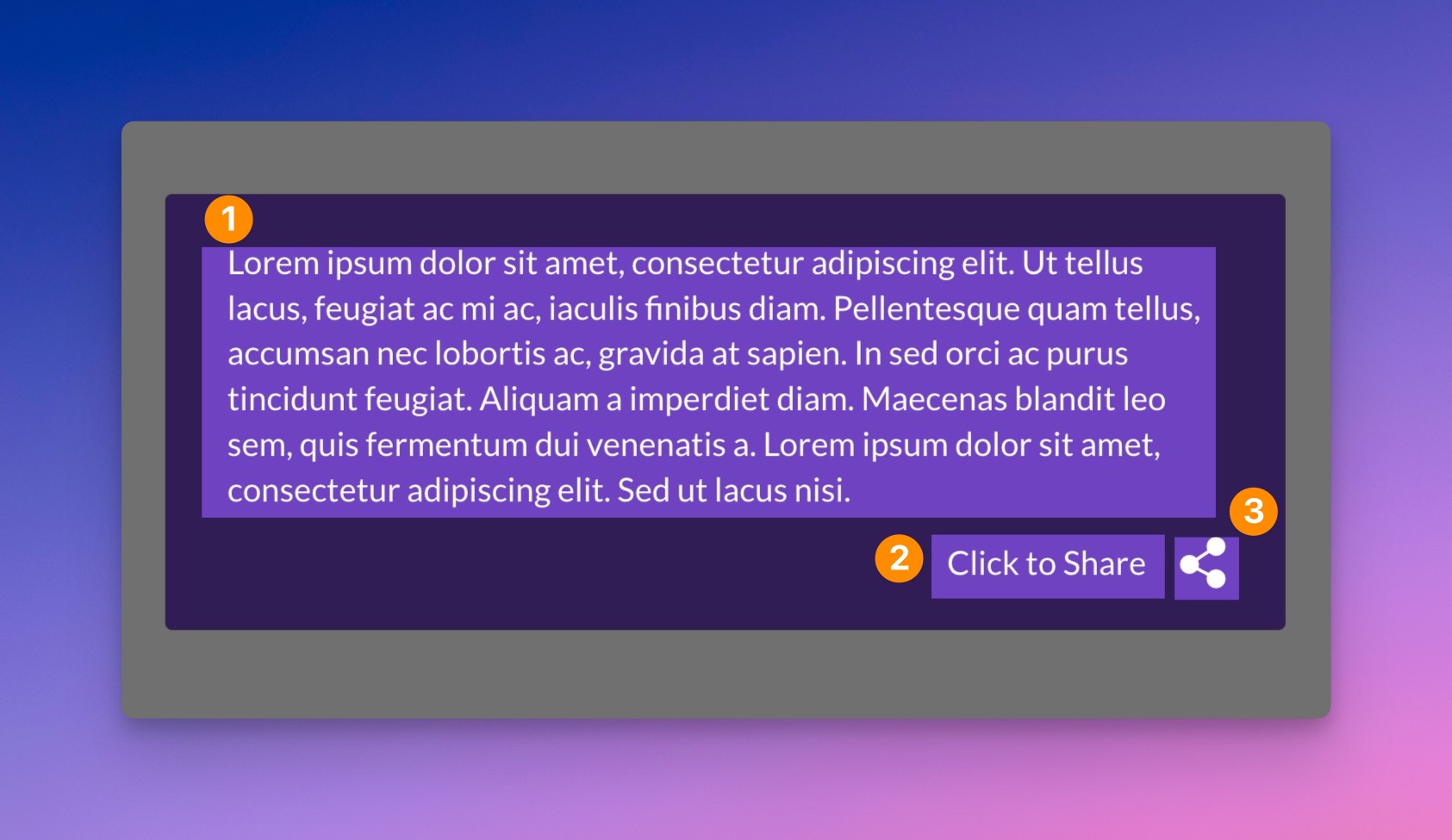
Diagram of Click to Share Box
- Click to Share text - This is the text that will be shared with the social networks.
- Click to Share button text - This is the text that is displayed for the Click to Share button.
- Click to Share icon - The icon used for the Click to Share button.
Here are the shortcode arguments available for the Click to Share shortcode box.
unique_id
Use this to wrap a unique ID around the shortcode, otherwise it'll be random.
theme
Can be:
- default (light appearance)
- purple
- blue
- dark
- orange
- pink
- none (choose to define your own styles)
- custom-slug (see creating your own Custom Shortcode Themes).
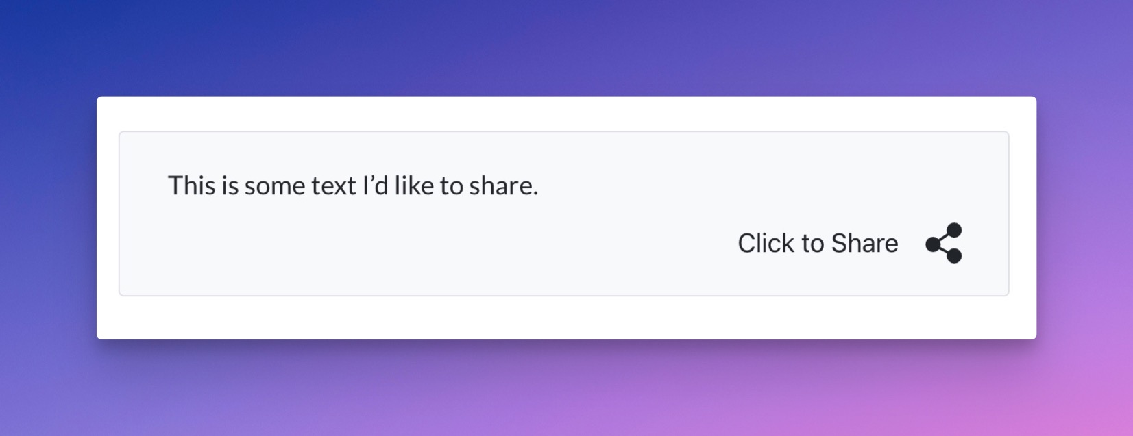
Default Theme
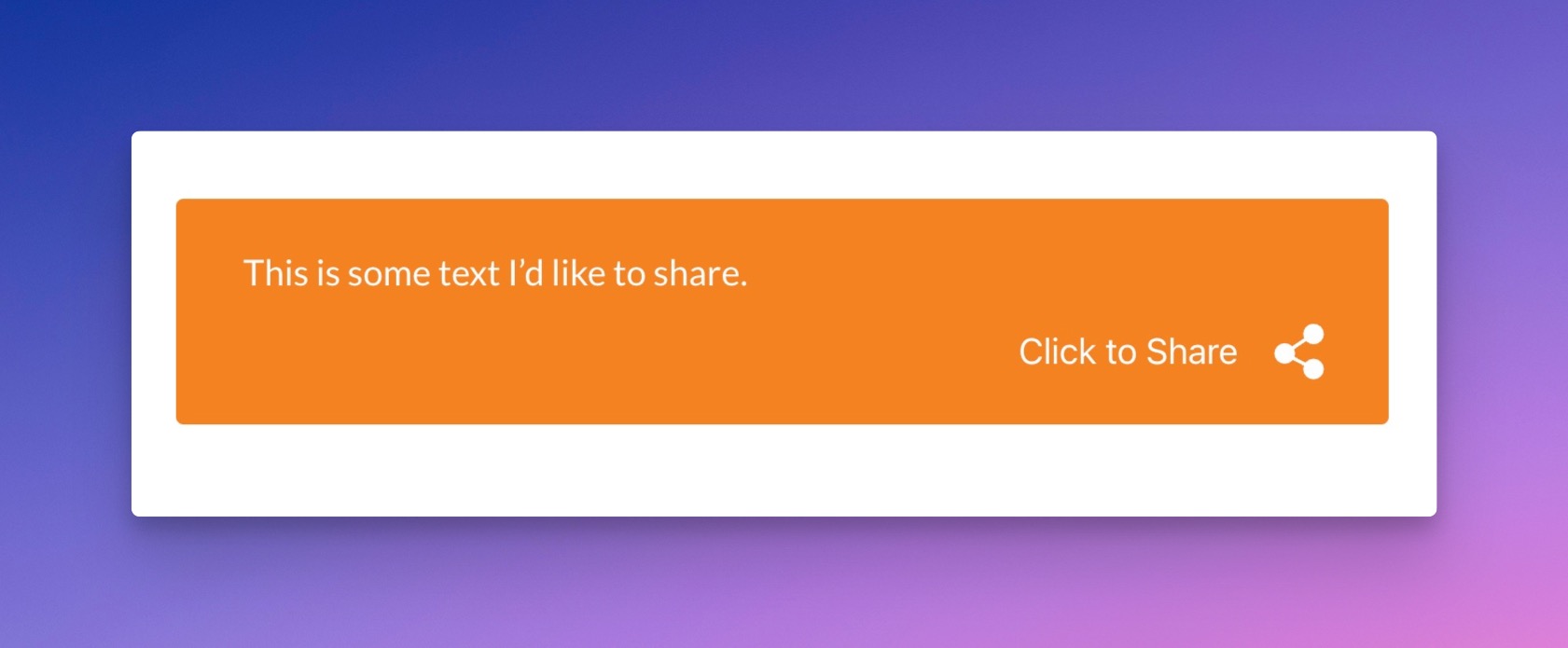
Orange Theme
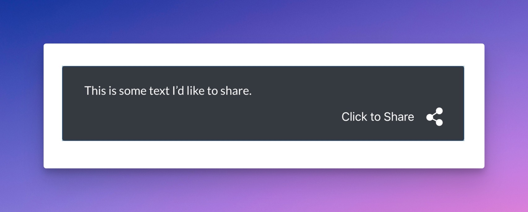
Dark Theme
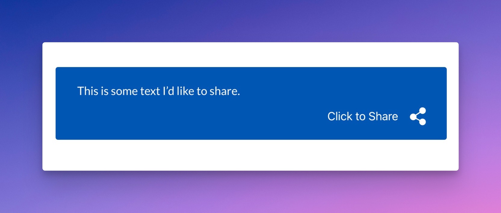
Blue Theme

Purple Theme
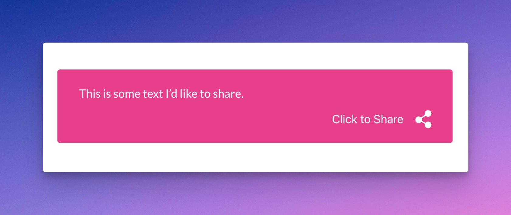
Pink Theme
align
Can be:
- left
- center (default)
- right
show_click_to_share
Show the Click to Share section with text and an icon.
Can be:
- true (default)
- false
Example:
[has_click_to_share show_click_to_share="false"]This is some text I'd like to share.[/has_click_to_share]
show_click_to_share_text
Show or hide the label in the Click to Share icon section.
Can be:
- true (default)
- false
Example:
[has_click_to_share show_click_to_share_text="false"]This is some text I'd like to share.[/has_click_to_share]
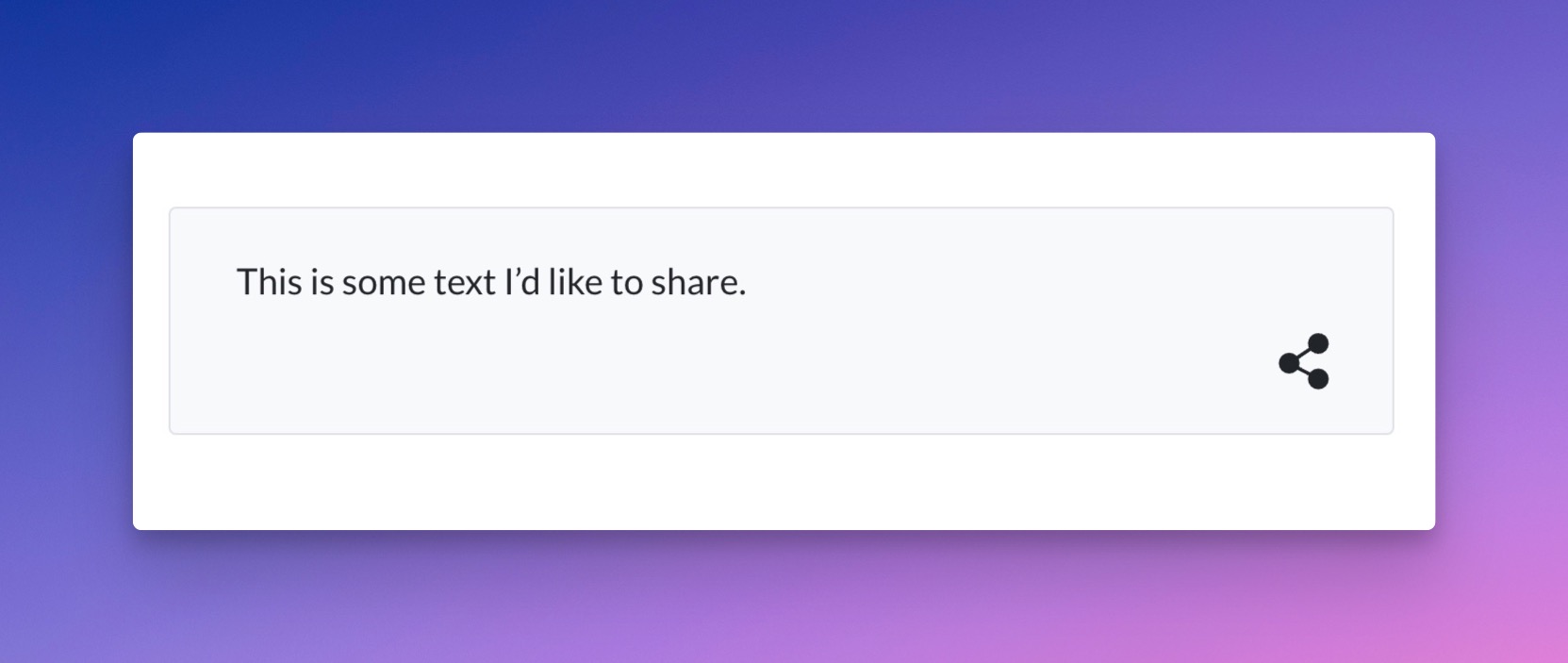
Click to Share With Sharing Label Hidden
show_icon
Show or hide the icon in the Click to Share icon section.
Can be:
- true (default)
- false
[has_click_to_share show_icon="false"]This is some text I'd like to share.[/has_click_to_share]
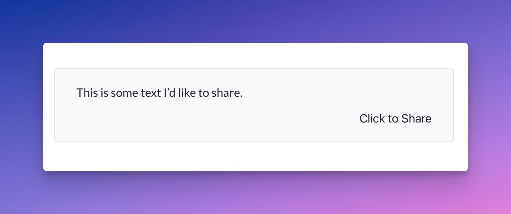
Click to Share Section Without an Icon
icon
Determine which sharing icon will be used in the Click to Share box.
Can be:
has-share-1

Icon: has-share-1
has-share-2
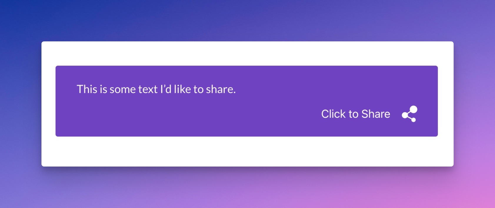
has-share-2
has-share-3

has-share-3
has-share-4
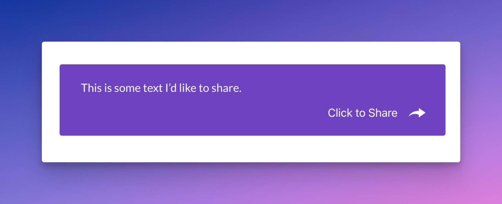
has-share-4
has-share-5
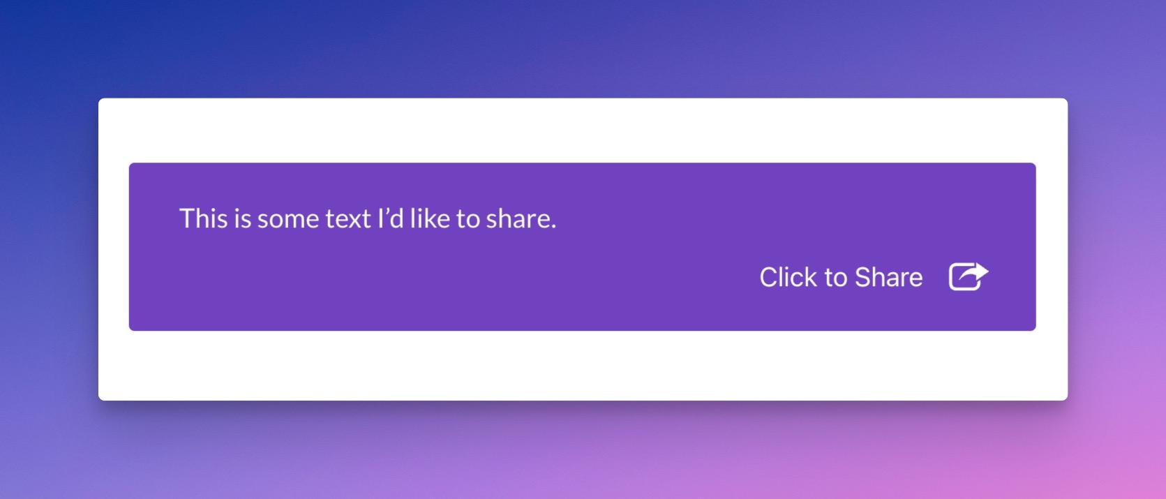
has-share-5
has-share-6
has-share-6
has-share-7
has-share-7
has-share-8
has-share-8
has-share-9
has-share-9
Example:
[has_click_to_share theme="purple" icon="has-share-9"]This is some text I'd like to share.[/has_click_to_share]
icon_size
Determine the icon size of the Click to Share icon section.
Can be:
- small
- medium (default)
- large
Example:
[has_click_to_share theme="pink" icon_size="large"]This is some text I'd like to share.[/has_click_to_share]
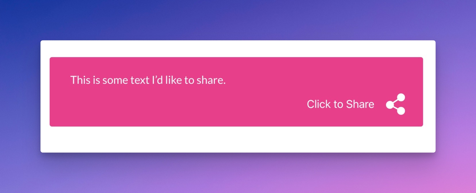
Pink Theme With Large Icon Size
custom_share_text
Input text that will be shared instead of the wrapped sharing text.
Example:
[has_click_to_share custom_share_text="Share this instead"]This is some text I'd like to share.[/has_click_to_share]
font_family
Choose the font family that will be used for the Click to Share shortcode.
Can be:
- (or custom font family)
Example:
[has_click_to_share theme="purple" icon="has-share-9" font_family="Josefin Sans" button_font_family="Lato"]This is some text I'd like to share.[/has_click_to_share]
button_font_family
Choose the font family that will be used for the Click to Share button.
Can be:
- (or custom font family)
Example:
[has_click_to_share theme="purple" icon="has-share-9" font_family="Josefin Sans" button_font_family="Lato"]This is some text I'd like to share.[/has_click_to_share]
click_text
This will change the Click to Share button text.
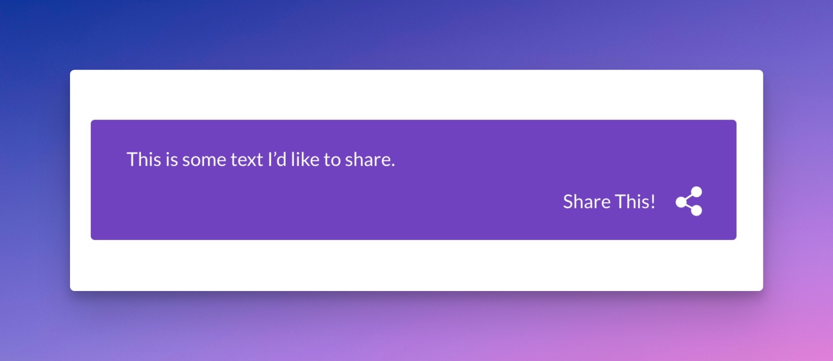
Custom Share This Text in the Button Area
Example:
[has_click_to_share theme="purple" click_text="Share This!"]This is some text I'd like to share.[/has_click_to_share]
margin
Specify the margin that'll be used for the Click to Share shortcode. This will override a theme default.
Default: empty.
Example:
[has_click_to_share margin="20px auto"]This is some text I'd like to share.[/has_click_to_share]
padding
Specify the padding that'll be used for the Click to Share shortcode. This will override a theme's default styles.
Example:
[has_click_to_share theme="purple" padding="35px 45px"]This is some text I'd like to share.[/has_click_to_share]
icon_color, icon_color_hover
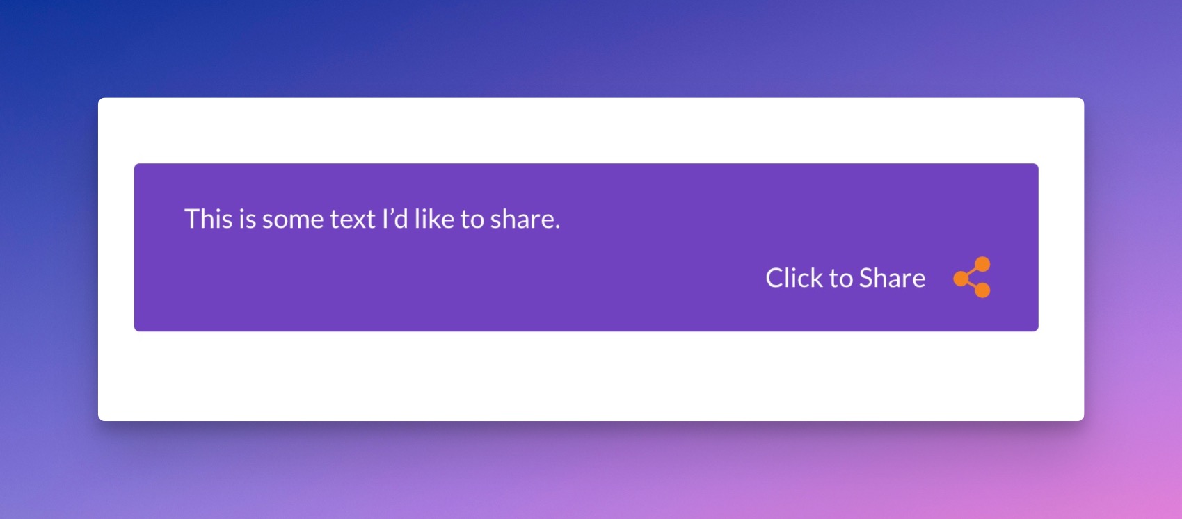
Custom Icon Color and Hover Color
Set the default color and hover color of the Click to Share icon.
Example:
[has_click_to_share theme="purple" icon_color="#f58220" icon_color_hover="#e76f1a"]This is some text I'd like to share.[/has_click_to_share]
text_color, text_color_hover
Set the default and hover color value of the main body text in the Click to Share box.
Example:
[has_click_to_share theme="purple" text_color="#f58220" text_color_hover="#e76f1a"]This is some text I'd like to share.[/has_click_to_share]
share_text_color, share_text_color_hover
Set the default and hover color of the sharing button.
Example:
[has_click_to_share theme="purple" share_text_color="#f58220" share_text_color_hover="#e76f1a"]This is some text I'd like to share.[/has_click_to_share]
background_color, background_color_hover
Set the default and hover background color of the Click to Share box.
Example:
[has_click_to_share theme="default" background_color="#dee2e6" background_color_hover="#FFFFFF"]This is some text I'd like to share.[/has_click_to_share]
font_size
The font size of the sharing text in the Click to Share box.
Can be:
- small
- medium (default)
- large
Example:
[has_click_to_share theme="default" font_size="large"]This is some text I'd like to share.[/has_click_to_share]
click_share_font_size
The font size of the sharing button in the Click to Share box.
Can be:
- small
- medium (default)
- large
Example:
[has_click_to_share theme="default" click_share_font_size="large"]This is some text I'd like to share.[/has_click_to_share]
border, border_hover
Set the CSS border of the Click to Share box in normal and hover state.
Example:
[has_click_to_share theme="default" border="1px solid red" border_hover="1px solid black"]This is some text I'd like to share.[/has_click_to_share]
border_radius
Specify the CSS border radius of the Click to Share box.
Example:
[has_click_to_share theme="default" border_radius="10px"]This is some text I'd like to share.[/has_click_to_share]
max_width
The maximum width of the Click to Share box. Can be any valid CSS width.
Example:
[has_click_to_share theme="default" max_width="550px" border_radius="10px"]This is some text I'd like to share.[/has_click_to_share]